千呼万唤始出来的自定义布局功能终于可以用了,这就给了我们更多自由发挥创造的空间,不再局限于使用已有组件做组合。当然,用 NAPI 和 C|C++页可以实现自己绘制所有内容,更别提还有类似XComponent这种东西了。但假如我们只是需要简单的自己控制子组件所在的位置,不需要接管绘制等逻辑,比如实现一个扇形菜单、实现一个可以控制行数的标签列表等,怎么搞嘞?现在鸿蒙提供了onPlaceChildren和onMeasureSize这两个回调方法,使得我们可以按照自己的意愿来摆放组件。
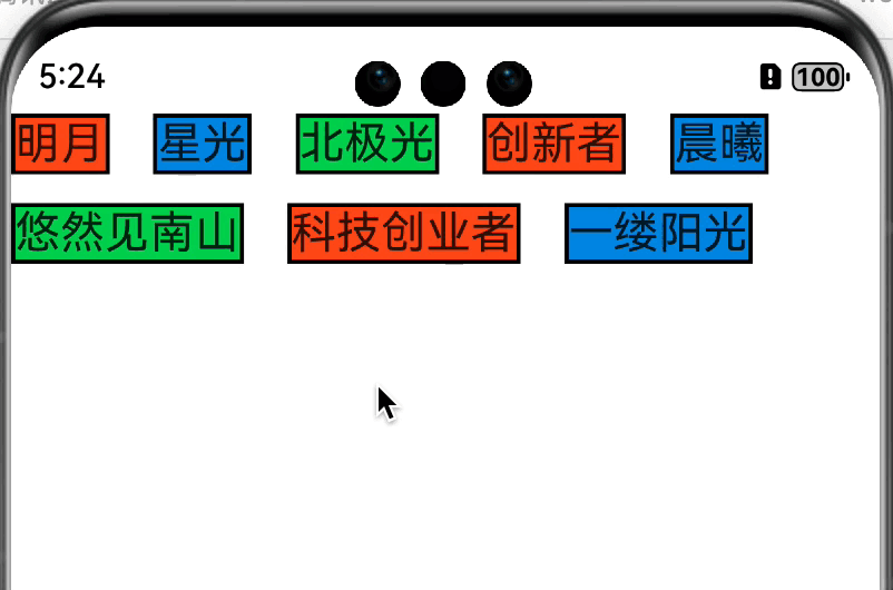
老样子,先放效果图
前提 我们先来了解一下这两个回调方法:
1
2
onMeasureSize (selfLayoutInfo: GeometryInfo, children: Array <Measurable>, constraint: ConstraintSizeOptions ) {}onPlaceChildren (selfLayoutInfo: GeometryInfo, children: Array <Layoutable>, constraint: ConstraintSizeOptions ) {}
onMeasureSize
ArkUI框架会在自定义组件确定尺寸时,将该自定义组件的节点信息和尺寸范围通过onMeasureSize传递给该开发者。不允许在onMeasureSize函数中改变状态变量。
在build方法调用之后,就会调用onMeasureSize方法。在该方法中,我们可以获取到组件本身和子组件的大小,通过计算确认组件本身大小后返回一个SizeResult对象,告知系统该组件最终大小。
selfLayoutInfo 在该方法的的参数中,有一个GeometryInfo对象实例selfLayoutInfo.通过这个对象,我们可以拿到父组件的宽高、padding、margin、borderWidth等信息。selfLayoutInfo的解释为父组件布局信息 ,这里的父组件是指的自定义组件本身,而不是包含该自定义组件的组件。举个简单的例子:CustomLayout,有如下布局
1
2
3
4
5
6
7
8
9
@Entry @Component LineLimitFlexPage {build (Column () {CustomLayout ().width ('90%' ).border ({ width : 2 , color : Color .Yellow , radius : 2 }).padding (2 ).margin (2 )width ('90%' ).border ({ width : 6 , color : Color .Red , radius : 6 }).padding (6 ).margin (6 )
我们在CustomLayout组建内重写onMeasureSize方法,将相关信息打印出来
1
2
3
onMeasureSize (selfLayoutInfo : GeometryInfo , children : Array <Measurable >, constraint : ConstraintSizeOptions ):SizeResult {error (0x01 , "LineLimitFlexPage" , `onMeasureSize selfLayoutInfo: ${JSON .stringify(selfLayoutInfo)} ` )
日志信息是这样的
1
2
onMeasureSize selfLayoutInfo: {"borderWidth":{"top":2,"right":2,"bottom":2,"left":2},"margin":{"top":2,"right":2,"bottom":2,"left":2},"padding":{"top":2,"right":2,"bottom":2,"left":2},"width":292.9846003605769,"height":731.3846153846154}
可以看到,打印出来的信息是自定义组件本身的属性。
constraint 另外,还有一个constraint的ConstraintSizeOptions对象,文档中对其解释是设置约束尺寸,组件布局时,进行尺寸范围限制。 ,同样也打印一下,
1 onMeasureSize constraint: {"minWidth":0,"minHeight":0,"maxWidth":285.59998497596155,"maxHeight":724}
可以看到有四个属性:最小宽度,最小高度,最大宽度,最大高度。这也是我们组件大小的下限和上限。
children 一个关键的参数:children: Array<Measurable>,子组件的布局信息。这里并没有直接把子组件传递下来,而是抽象成了Measurable对象。该对象有四个方法
1
2
3
4
measure (constraint : ConstraintSizeOptions ): MeasureResult ;getMargin (): DirectionalEdgesT <number >;getPadding (): DirectionalEdgesT <number >;getBorderWidth (): DirectionalEdgesT <number >;
见名知义,没有什么好说的,我们通过measure方法可以获取到子组件的大小,之后通过计算,综合子组件大小、selfLayoutInfo、constraint三者的信息来计算该组件需要的大小。并且返回SizeResult对象,来告知系统该组件的最终大小。
onPlaceChildren 在来看onPlaceChildren方法,在该方法中的selfLayoutInfo和constraint这两个参数,和onMeasureSize方法中的参数含义是相同的,这里不再赘述。children: Array<Layoutable>参数。这里也是把子组件抽象成了Layoutable对象,它有一个measureResult: MeasureResult;属性和四个方法:
1
2
3
4
layout (position : Position ): void ;getMargin (): DirectionalEdgesT <number >;getPadding (): DirectionalEdgesT <number >;getBorderWidth (): DirectionalEdgesT <number >;
同样的见名知义,没有什么好说的。我们不需要了解子组件的具体信息,只需要关心子组件大小和摆放的位置就好。这里我们通过layout方法来确认子组件摆放位置。
实现 前置的条件我们都已经了解了,那么如何实现一个简易版可指定展示行数的 Flex 也就有思路了。这里为了简单,我们只考虑横向从左向右排列的情况,没有考虑 padding 和 margin属性。其他的属性大家有兴趣可以自己实现
思路 在onMeasureSize方法中测量并获取每个子组件的大小,长度累加大于等于约束的最大宽度则换行,高度累加。直到超过指定行数或者遍历完子组件结束。返回组件大小。onPlaceChildren方法中遍历子组件,通过子组件的宽高确认摆放位置,长度累加大于等于约束的最大宽度则换行,高度累加,直到超过指定行数或者遍历完子组件结束。
属性 这里我们只考虑水平间隔和垂直间隔以及指定行数
1
2
3
4
5
6
@Component CustomLayout {hSpace : number = 0 vSpace : number = 0 @Prop maxLine : number
这里还有一些需要特别注意的细节点:
自定义布局暂不支持LazyForEach写法。
使用builder形式的自定义布局创建,自定义组件的build()方法内只允许存在this.builder(),即示例的推荐用法。
父容器(自定义组件)上设置的尺寸信息,除aspectRatio之外,优先级小于onMeasureSize设置的尺寸信息。
子组件设置的位置信息,offset、position、markAnchor优先级大于onPlaceChildren设置的位置信息,其他位置设置属性不生效。
使用自定义布局方法时,需要同时调用onMeasureSize和onPlaceChildren方法,否则可能出现布局异常。
准备 既然这样,我们先准备好大致框架
我们的自定义布局
1
2
3
4
5
6
7
8
9
10
11
12
13
14
15
@Component CustomLayout {hSpace : number = 0 vSpace : number = 0 @Prop maxLine : number @Prop showAll : boolean @Builder doNothingBuilder (@BuilderParam builder : () => void = this .doNothingBuilder ;onMeasureSize (selfLayoutInfo : GeometryInfo , children : Array <Measurable >, constraint : ConstraintSizeOptions ): SizeResult {}onPlaceChildren (selfLayoutInfo: GeometryInfo, children: Array <Layoutable>, constraint: ConstraintSizeOptions ) {}
一个全局的@Builder修饰的布局,也就是我们的子控件
1
2
3
4
5
6
7
8
9
10
11
const colors : string [] = ["#ff6134" , "#1b91e0" , "#39d167" ]@Builder function ColumnChildren (ForEach ([1 , 2 , 3 , 4 , 5 , 6 , 7 , 8 , 9 , 10 , 11 , 12 , 13 , 14 , 15 ], (index: number ) => { Text ('标签' + index)fontSize (30 )borderWidth (2 ).backgroundColor (colors[index%3 ])
一个页面
1
2
3
4
5
6
7
8
9
10
11
12
13
@Entry @Component LineLimitFlexPage {build (Column () {CustomLayout ({builder : ColumnChildren ,hSpace : vp2px (10 ),vSpace : vp2px (6 ),maxLine : 3
这样我们就准备好了框架内容,接下来就是处理测量组件大小及布局了
测量组件 我们按照上面的思路在onMeasureSize方法中对子组件进行测量,并确认组件大小。
1
2
3
4
5
6
7
8
9
10
11
12
13
14
15
16
17
18
19
20
21
22
23
24
25
26
27
28
29
30
31
32
33
34
35
36
37
38
39
40
41
42
43
44
45
46
47
48
49
50
51
52
53
onMeasureSize (selfLayoutInfo : GeometryInfo , children : Array <Measurable >, constraint : ConstraintSizeOptions ): SizeResult {error (0x01 , "LineLimitFlexPage" , `onMeasureSize selfLayoutInfo: ${JSON .stringify(selfLayoutInfo)} ` )error (0x01 , "LineLimitFlexPage" , `onMeasureSize constraint: ${JSON .stringify(constraint)} ` )let totalWidth = 0 let totalHeight = 0 let lineHeight = 0 ;let firstLineHeight = 0 let lineCount = 1 for (let i = 0 ; i < children.length ; i++) {let child = children[i]let result : MeasureResult = child.measure ({minHeight : 0 ,minWidth : 0 ,maxWidth : selfLayoutInfo.width ,maxHeight : selfLayoutInfo.height width Math .max (lineHeight, result.height )if (totalWidth > selfLayoutInfo.width ) {if (firstLineHeight == 0 ) {if (lineCount > this .maxLine ) {break ;this .vSpace width + this .vSpace 0 else {this .hSpace let result : SizeResult = {width : lineCount > 1 ? selfLayoutInfo.width : totalWidth,height : totalHeight + firstLineHeightreturn result
布局 在onPlaceChildren方法中确认每个组件的位置
1
2
3
4
5
6
7
8
9
10
11
12
13
14
15
16
17
18
19
20
21
22
23
24
25
26
27
onPlaceChildren (selfLayoutInfo: GeometryInfo, children: Array <Layoutable>, constraint: ConstraintSizeOptions ) {error (0x01 , "LineLimitFlexPage" , `onPlaceChildren: selfLayoutInfo: ${JSON .stringify(selfLayoutInfo)} ` )error (0x01 , "LineLimitFlexPage" , `onPlaceChildren: constraint: ${JSON .stringify(constraint)} ` )let startX = 0 ;let startY = 0 ;let lineCount = 1 for (let i = 0 ; i < children.length ; i++) {let child = children[i]let childWidth = child.measureResult .width ;let childHeight = child.measureResult .height if (startX + childWidth > selfLayoutInfo.width ) {0 this .vSpace if (lineCount > this .maxLine ) {break layout ({ x : startX, y : startY })this .hSpace
小结 这样我们就完成了一个简易版的可以指定行数的类 Flex 组件。和 Android 中的自定义布局对比一下,流程几乎是一致的,只不过方法签名不一样而已。对于初学者来讲还是挺友好的。
刷新 这里扩展一下,我们如何刷新自定义组件?@State修饰变量,在子组件中使用@Prop修饰变量,这样就能实现父子组件单向数据同步,父组件改变变量值时子组件同步刷新。那我们也这么写一下:
1
2
3
4
5
6
7
8
9
10
11
12
13
14
15
16
17
18
19
20
21
22
23
24
25
26
27
@Entry @Component LineLimitFlexPage {@State maxLine : number = 2 build (Column () {CustomLayout ({builder : ColumnChildren ,hSpace : vp2px (10 ),vSpace : vp2px (6 ),maxLine : this .maxLine onClick ((_ ) => {if (this .maxLine == 2 ){this .maxLine = Number .MAX_VALUE else {this .maxLine =2 @Component CustomLayout {hSpace : number = 0 vSpace : number = 0 @Prop maxLine : number
这样写完了,但是点击之后发现控件并没有刷新,这是啥原因? 咨询之后了解到因为子控件中的maxLine变量没有直接在子控件的build方法中使用,因此改变它的值不会触发build函数,更不会触发onMeasureSize和onPlaceChildren方法。invalidate()方法也刷新页面。咨询之后给了个比较魔幻的操作:额外定义一个变量,让这个变量参与build就好了,因此有了下面的代码:
1
2
3
4
5
6
7
8
9
10
11
12
13
14
15
16
17
18
19
20
21
22
23
24
25
26
27
28
29
30
31
32
33
34
35
36
37
38
39
@Entry @Component LineLimitFlexPage {@State maxLine : number = 2 @State showAll : boolean = false build (Column () {CustomLayout ({builder : ColumnChildren ,hSpace : vp2px (10 ),vSpace : vp2px (6 ),maxLine : this .maxLine ,showAll : this .showAll onClick ((_ ) => {if (this .showAll ) {this .maxLine = 2 else {this .maxLine = Number .MAX_VALUE this .showAll = !this .showAll @Component CustomLayout {hSpace : number = 0 vSpace : number = 0 @Prop maxLine : number @Prop showAll : boolean build (if (this .showAll ) {this .builder ()else {this .builder ()
嗯,这样点击控件的时候就能刷新了。。。。。
嗯,或者把这个if判断放在父组件中
1
2
3
4
5
6
7
8
Column () {if (this .showAll ){CustomLayout ({})else {CustomLayout ({})
哈哈哈哈哈哈哈, 就先这样吧。