ConstraintLayout
https://developer.android.google.cn/reference/android/support/constraint/ConstraintLayout
A ConstraintLayout is a ViewGroup which allows you to position and size widgets in a flexible way.
版本支持
ConstraintLayout是一个支持库,向前兼容到Android9,以后还会添加更多的新特性。现在公司的产品的最低版本支持都在2.3之上,部分产品最低版本支持保持在4.4之上。这就意味着我们不需要关心最低版本支持的事情。
新特性
在使用新特性的时候是不能有循环依赖的,比如相对定位,不能A依赖于B的位置,B依赖C的位置,而C又依赖A的位置
Relative positioning
相对定位是ConstraintLayout中最基本的构建方式,也就是一个空间相对于另外一个空间进行位置确定,可以在横向和竖向上进行约束:
Horizontal Axis: left, right, start and end sides
Vertical Axis: top, bottom sides and text baseline
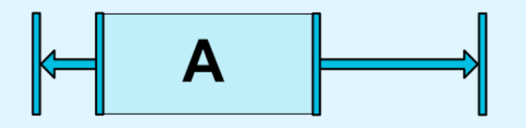
如果我们需要让ButtonB在ButtonA的右侧,如下图: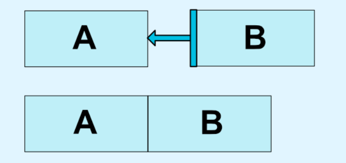
在布局文件中只需要:
1 | |
这就告诉系统 让buttonB的左边约束于buttonA的右边
下面列出了所有可用的约束方式:
- layout_constraintLeft_toLeftOf
- layout_constraintLeft_toRightOf
- layout_constraintRight_toLeftOf
- layout_constraintRight_toRightOf
- layout_constraintTop_toTopOf
- layout_constraintTop_toBottomOf
- layout_constraintBottom_toTopOf
- layout_constraintBottom_toBottomOf
- layout_constraintBaseline_toBaselineOf
- layout_constraintStart_toEndOf
- layout_constraintStart_toStartOf
- layout_constraintEnd_toStartOf
- layout_constraintEnd_toEndOf
各约束位置如下: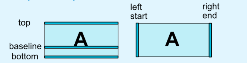
上面这些约束关系全部都是本身相对于另外一个控件(使用@id方式引用另外控件)或者父布局(使用parent方式引用父控件)进行约束
Margins
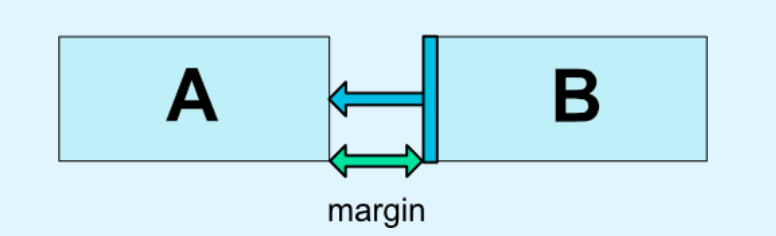
这里的外边距和其他布局方式的外边距一样,不能是负数,属性如下:
- android:layout_marginStart
- android:layout_marginEnd
- android:layout_marginLeft
- android:layout_marginTop
- android:layout_marginRight
- android:layout_marginBottom
添加的一个新属性是 maiginGone,当一个约束目标的可见性为GONE的时候(View.GONE),可以改变当前控件的外边距,比如B是相对于A进行约束,当A不可见的时候,可以改变B的外边距,也就是B的外边距可以根据Ade可见性设置不同的值,属性如下
- layout_goneMarginStart
- layout_goneMarginEnd
- layout_goneMarginLeft
- layout_goneMarginTop
- layout_goneMarginRight
- layout_goneMarginBottom
Centering positioning and bias
** Centering Positioning **
如果对一个控件的左右(上下)都添加的约束,那么ConstraintLayout的表现就像有两个大小相等方向相反的力在拉这个控件一个样,比如
1 | |
表现如下: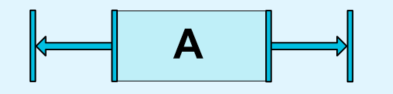
这样就会产生居中效果,如果子控件和父控件的尺寸相同,这写属性就没有意义了
** bias **
当遇到上面这种约束的时候,我们可以使用bias属性让控件偏向于哪一个方向,属性如下:
- layout_constraintHorizontal_bias
- layout_constraintVertical_bias
例如,如下代码:表现如下:1
2
3
4
5
6<android.support.constraint.ConstraintLayout ...>
<Button android:id="@+id/button" ...
app:layout_constraintHorizontal_bias="0.3"
app:layout_constraintLeft_toLeftOf="parent"
app:layout_constraintRight_toRightOf="parent/>
</>
Circular positioning (Added in 1.1)
这个属性是1.1版本添加进去的,可以使用angle和distance来约束一个控件的中心点和另外一个空间的中心点的位置关系,这样就可以把空间定位在一个圆上,可用属性如下:
- **layout_constraintCircle ** : references another widget id
- **layout_constraintCircleRadius ** : the distance to the other widget center
- **layout_constraintCircleAngle ** : which angle the widget should be at (in degrees, from 0 to 360)
示例如下:
1 | |
表现如下: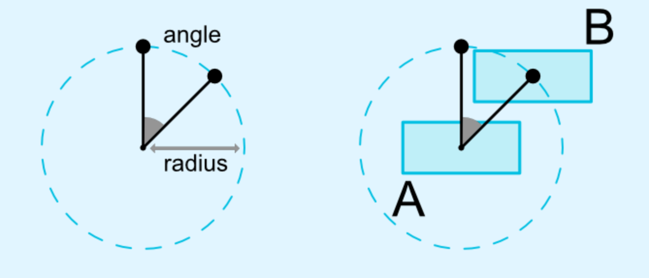
Visibility behavior
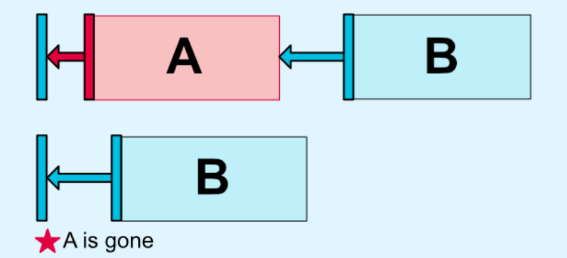
ConstraintLayout对于被标记为GONE的控件有特殊的处理。一般布局中,GONE控件是不会展示在界面上并且不再属于布局的一部分,但是在布局计算上,ConstraintLayout和传统布局有很大的区别
- 传统布局下,GONE控件会被认为大小是0,也就是一个点
- 在ConstraintLayout中其大小仍然按照可见大小计算,但是其外边距为0
Dimension constraints
Minimum dimensions on ConstraintLayout
可以像普通控件一样设置最小最大尺寸,属性如下:
- ** android:minWidth ** set the minimum width for the layout
- ** android:minHeight ** set the minimum height for the layout
- ** android:maxWidth ** set the maximum width for the layout
- ** android:maxHeight ** set the maximum height for the layout
这些属性当ConstraintLayout的宽高为WRAP_CONTENT时有效。
Widgets dimension constraints
可以通过android:layout_width和android:layout_height设置控件的尺寸,有三种方式:
- 固定值
- WRAP_CONTENT
- 0dp, 相当于
MATCH_CONSTRAINT
前两种方式和普通布局表现出来的行为一样。最后一种会通过约束来重新设置控件尺寸,如果设置了margin,在布局计算的时候也会被考虑进去。
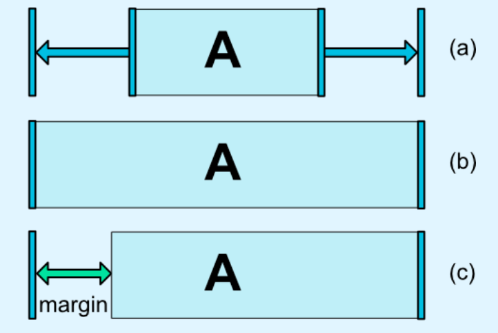
上图中的a是wrap_content,b是0dp,c是设置了margin的0dp。需要注意的是,在ConstraintLayout中,MATCH_PARENT是不推荐使用的。
WRAP_CONTENT:enforcing constraints (Added in 1.1)
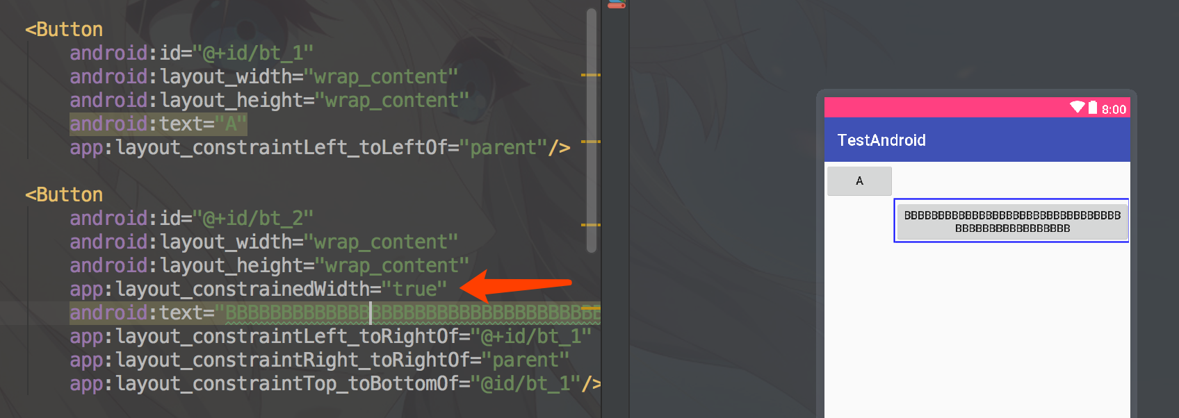
如果控件实际尺寸超过了约束的尺寸,那么约束就会失效,这时候可以添加如下属性来限制:
- app:layout_constrainedWidth=”true|false”
- app:layout_constrainedHeight=”true|false”
将B控件约束于A控件和父控件的中间,尺寸都为wrap_content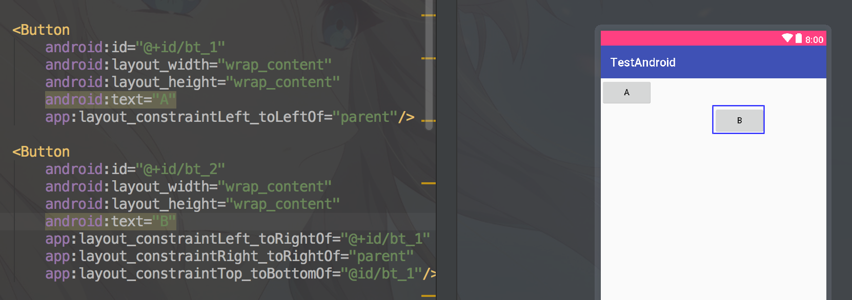
这时候如果将B控件填充很长的文件,那么B控件的左侧则会突破约束,和A控件的中心对齐,如果我们不想要这种方式,还是要求B的左侧和Ade右侧对齐,则可以天剑layout_constrainedWidth="true"属性进行约束,实例如下: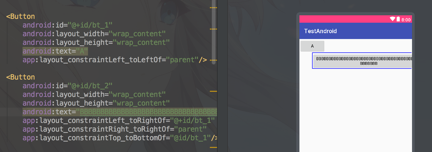
MATCH_CONSTRAINT dimensions (Added in 1.1)
当控件的尺寸被设置为MATCH_CONSTRAINT时,默认的行为是占据所有的剩余空间,可以使用如下属性来更改此行为:
- ** layout_constraintWidth_min ** 和 ** layout_constraintHeight_min ** : will set the minimum size for this dimension
- ** layout_constraintWidth_max ** 和 ** layout_constraintHeight_max ** : will set the maximum size for this dimension
- ** layout_constraintWidth_percent ** 和 ** layout_constraintHeight_percent ** : will set the size of this dimension as a percentage of the parent
Percent dimension
To use percent, you need to set the following:
想要使用百分比布局,需要设置如下属性:
- 控件宽高设置为
MATCH_CONSTRAINT(0dp) app:layout_constraintWidth_default属性值设置为percent- 设置
layout_constraintWidth_percent或者layout_constraintHeight_percent属性值(0-1之间)
下面的TextView控件将占据剩余宽度的50%和剩余高度的50%,示例:
1 | |
Ratio
可以设置控件的宽高比例,为了实现这种方式,需要让控件的宽或者高设置为0dp(MATCH_CONSTRAINT),如下:
1 | |
这样的话,高度会随着宽度的改变而改变,并且大小和宽度一致。设置宽高比的方式有两种:
- 一个浮点数,
受约束的一方的尺寸/另一方尺寸得到的数字 - 宽度:高度
如果宽高两个方向同时设置了0dp(MATCH_CONSTRAINT),系统会设置满足比例的最大尺寸,这种情况下还要保持宽高比例,需要在比例前面添加W或者H以确定受约束的是高还是宽。
You can also use ratio if both dimensions are set to MATCH_CONSTRAINT (0dp). In this case the system sets the largest dimensions the satisfies all constraints and maintains the aspect ratio specified. To constrain one specific side based on the dimensions of another, you can pre append W,” or H, to constrain the width or height respectively. For example, If one dimension is constrained by two targets (e.g. width is 0dp and centered on parent) you can indicate which side should be constrained, by adding the letter W (for constraining the width) or H (for constraining the height) in front of the ratio, separated by a comma:
2
3
4
5<Button android:layout_width="0dp"
android:layout_height="0dp"
app:layout_constraintDimensionRatio="H,16:9"
app:layout_constraintBottom_toBottomOf="parent"
app:layout_constraintTop_toTopOf="parent"/>
will set the height of the button following a 16:9 ratio, while the width of the button will match the constraints to parent.
Chains
Chains 在单轴(水平或垂直)上提供类似组的行为。另一个轴可以独立地约束。
Creating a chain
如果一组小部件通过双向连接链接在一起,则它们被视为链(参见下图,显示最小链,具有两个小部件)。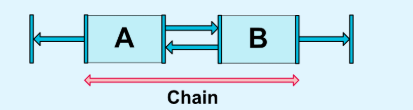
Chain heads
横向上,Chain头部是Chain最左边的控件;纵向上,Chain头部是Chain最顶部的控件。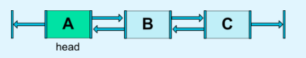
Margins in chains
如果连接时定义了外边距,Chain就会发生变化。在SPREAD CHAIN中,外边距会从已经分配好的空间中去掉。原文如下:
If margins are specified on connections, they will be taken in account. In the case of spread chains, margins will be deducted from the allocated space.
Chain Style
当对Chain的第一个元素设置layout_constraintHorizontal_chainStyle或layout_constraintVertical_chainStyle属性,Chain就会根据特定的样式(默认样式为CHAIN_SPREAD)进行相应变化,样式类型如下:
- CHAIN_SPREAD – 元素呗分散开 (默认样式)
- Weighted chain – 在 CHAIN_SPREAD mo样式中,如果某些控件设置了
MATCH_CONSTRAINT属性, 他们将平分剩余空间 - CHAIN_SPREAD_INSIDE – Chain的头尾元素紧贴父容器
- CHAIN_PACKED – Chain中的所有控件合并在一起后在剩余的空间中居中
图示如下: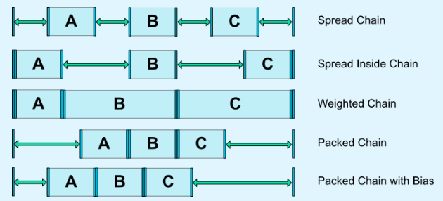
Weighted chains
默认的Chain会在空间里平均散开。如果其中有一个或多个元素使用了MATCH_CONSTRAINT属性,那么他们会将剩余的空间平均填满。属性layout_constraintHorizontal_height和layout_constraintVertical_weight控制使用MATCH_CONSTRAINT的元素如何均分空间。 例如,一个Chain中包含两个使用MATCH_CONSTRAINT的元素,第一个元素使用的权重为2,第二个元素使用的权重为1,那么被第一个元素占用的空间是第二个元素的2倍。
Margins and chains (in 1.1)
在chain中是可以使用margin属性的,例如,在一个水平的chain中,一个元素定义了right_magin=10dp,下一个元素定义了margin_left=5dp,那么两者之间的间距就是15dp.
Virtual Helpers objects
Guideline
Guideline是只能用在ConstraintLayout布局里面的一个工具类,用于辅助布局,类似为辅助线,可以设置android:orientation属性来确定是横向的还是纵向的。
- 当设置为vertical的时候,Guideline的宽度为0,高度是parent也就是ConstraintLayout的高度
- 同样设置为horizontal的时候,高度为0,宽度是parent的宽度
定位Guideline有三种方式,这三种方式只能选择一个
- 指定距离左侧或顶部的固定距离(layout_constraintGuide_begin)
- 指定距离右侧或底部的固定距离(layout_constraintGuide_end)
- 指定在父控件中的宽度或高度的百分比(layout_constraintGuide_percent)
示例如下:
1 | |
声明了一个垂直居中,一个水平居中的GuideLine,效果如下,这两个控件在View上是不可见的。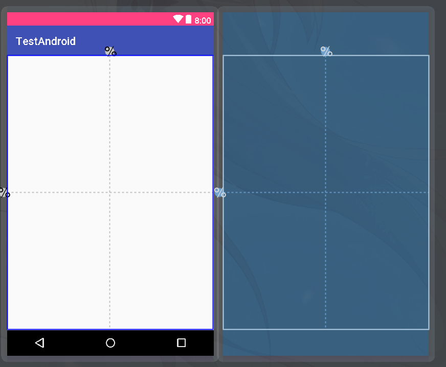
接着就可以根据这两条辅助线来定位其他控件了
1 | |
效果如下: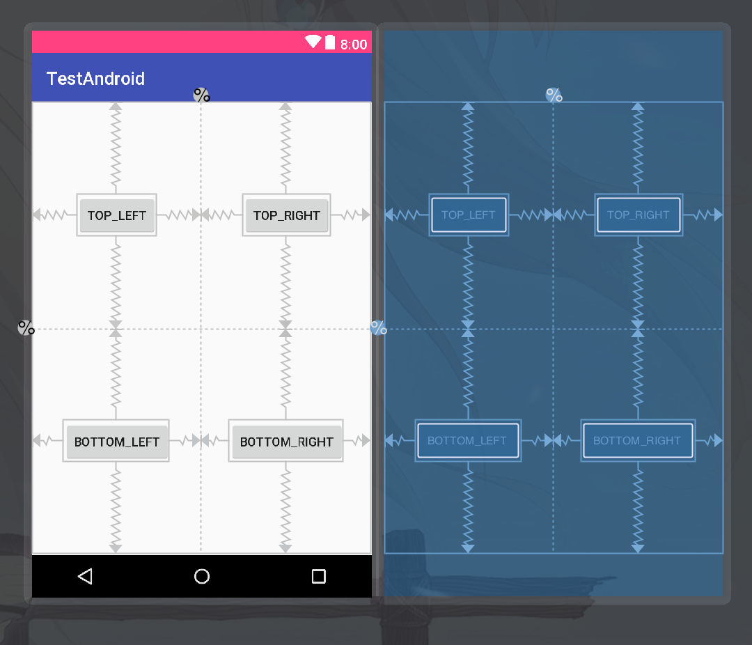
Barrier
Barrier可以引用多个控件,根据他们之中最大的宽高来创建一个虚拟的guideline,
假设我们有两个按钮,@id/button1和@id/button2,让Barrier的constraint_referenced_ids属性引用这两个id,如下:
1 | |
示例如下: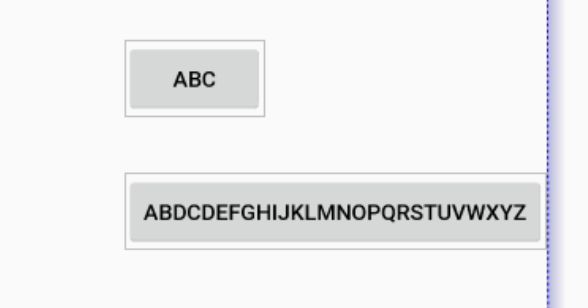
图中蓝色的线就是Barrier,Barrier所在问的方位由barrierDirection确定,可以设置为start,end,top,bottom,right,left
这时候我们改变一个两个按钮的宽度,让button2的宽度小于button1,则效果如下: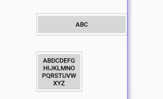
这样我们就可以把其他控件约束于barrier的右侧,使得button1和button2不会覆盖(被覆盖)其他控件
Group
Group可以包含多个对其他控件的引用,这样我们操作这个group就相当于操作引用的控件
1 | |
像上面这样,只要操作Group的visibility属性,就相当于同时操作@id/login,@id/register,@id/modify_password这三个控件的visibility属性。
Placeholders
顾名思义就是一个用来占位的东西,对于样式相同,功能不同的界面,可以把样式做成style或者使用PlaceHolders来做:
1 | |
如果想要在预览界面看起来像是在ConstraintLayout里面的话就加上tools:parentTag="android.support.constraint.ConstraintLayout"
预览如下:
在上面的布局文件中,每一个Placeholder都添加了app:content属性,表示要用这个属性指定的id对应的控件来替换Placeholder,
在其他布局文件中:
1 | |
首先使用include标签将模板包含进来,然后创建其他需要替换的控件:
当然也可以在代码中调用Placeholder.setContent(id)动态替换,配合CoordinatorLayout可以做出比较好玩的动画效果:
代码在这里
https://github.com/Thumar/Placeholder
ConstraintLayout 1.1版本之后的东西常用的差不多就这些了
以上